
Persuasion was a book cover design project I did as an assignment during the 2017-18 school year.

The goal of the assignment was to take any already published book and redesign the cover. Requirements included a comprehensive understanding of the book; use of themes, motifs, and symbols; and good formal composition. I thought about using Jane Eyre for this purpose, but I decided the abundance of symbols in that story would not be enough of a challenge, or even, as often happens, become an obstacle in itself. I chose Persuasion by Jane Austen firstly because I love the book, secondly because I didn't have any idea what to do with it, and that intrigued me, and thirdly because while Austen books like Emma, Pride & Prejudice, and Sense & Sensibility have gotten their share of redesigns, my personal favorite has been sadly neglected.

I determined I wanted my redesign to angle for an audience broad enough to attract first-time readers, but mostly avid Austen fans, familiar with the story.
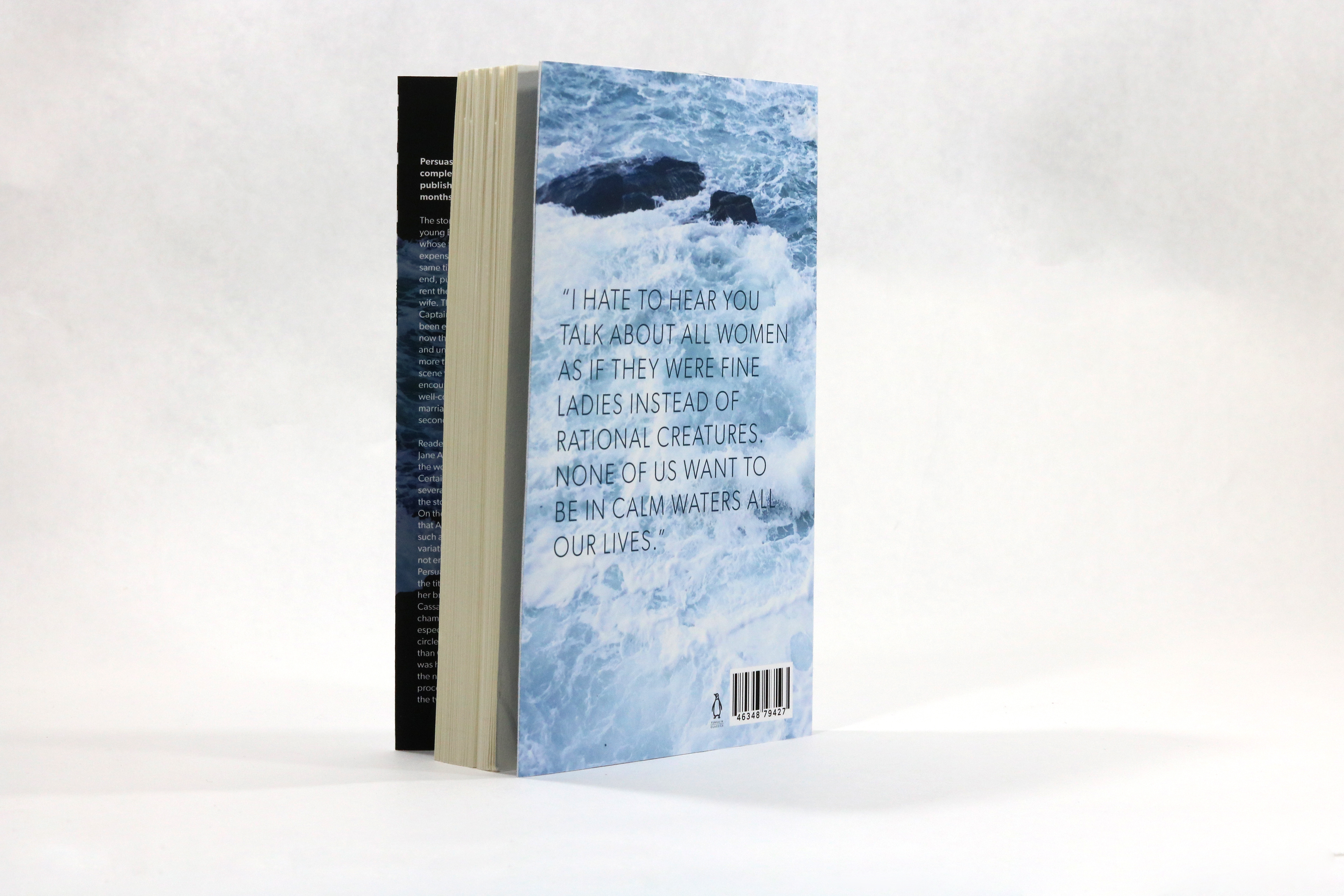
Lacking significant symbols from the plot, I decided to start the process based on my concept for the back. Being a classic novel, it would not need blurbs, and since my audience would be mostly those already familiar with the story, I thought I would use Austen’s own voice as the main feature on the back cover. It didn't take long to decide on one of the book’s most famous lines, spoken by the hero’s sister: “I hate to hear you talk about all women as if they were fine ladies instead of rational creatures. None of us want to be in calm waters all our lives.”
This line became the mantra to guide the entire design. The idea was to recreate the Austen novel cover from its usual covering – antique paintings of fragile, blushing ladies – to a book that reflects its heroine: sensible, strong, and unassuming.
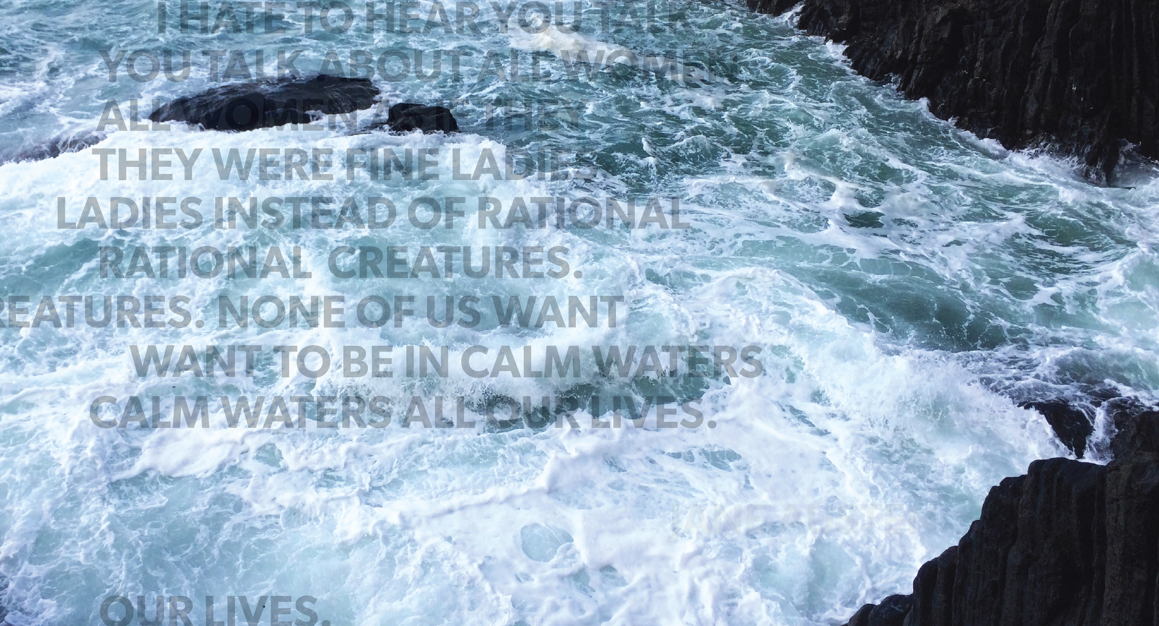

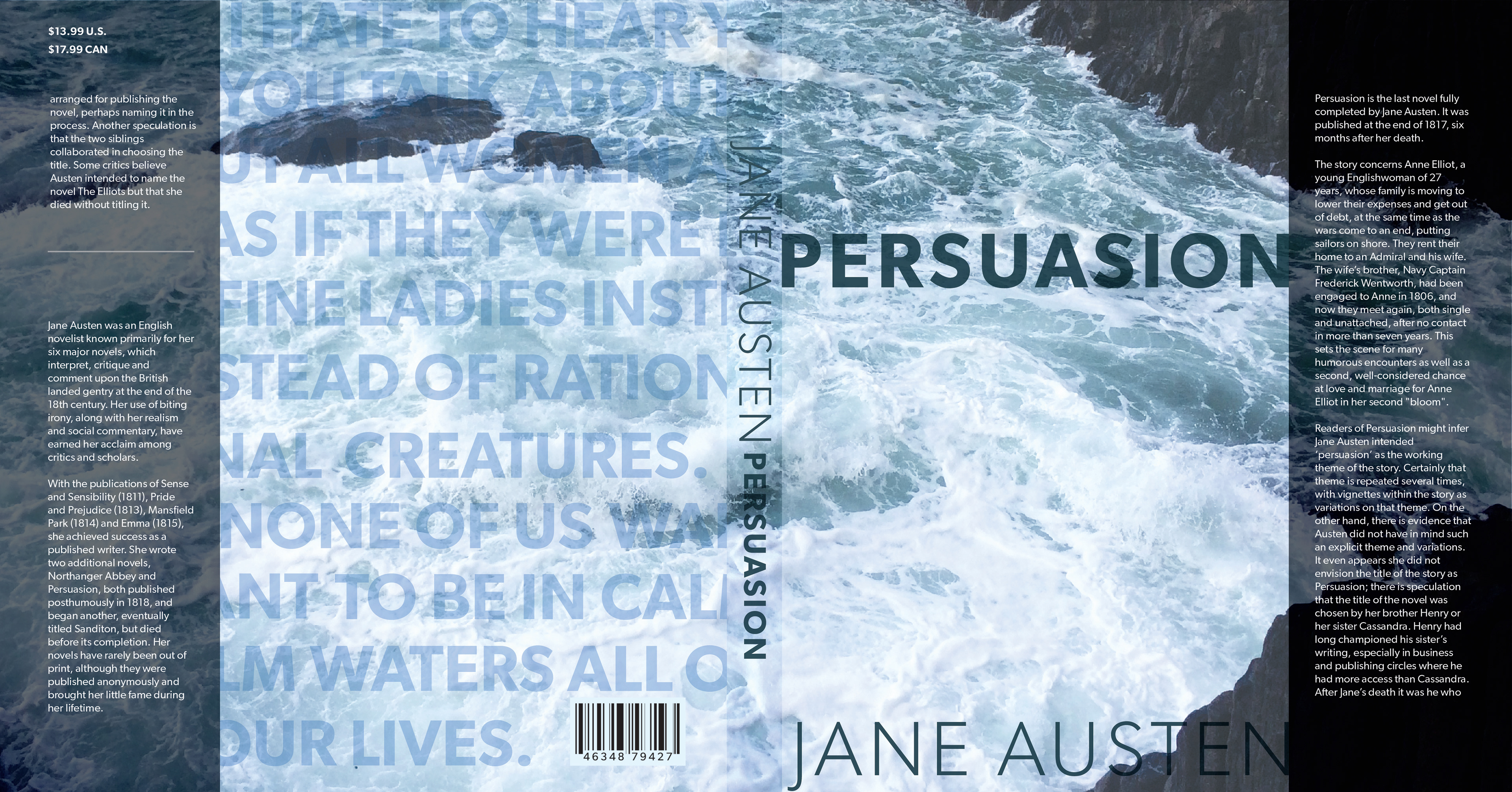
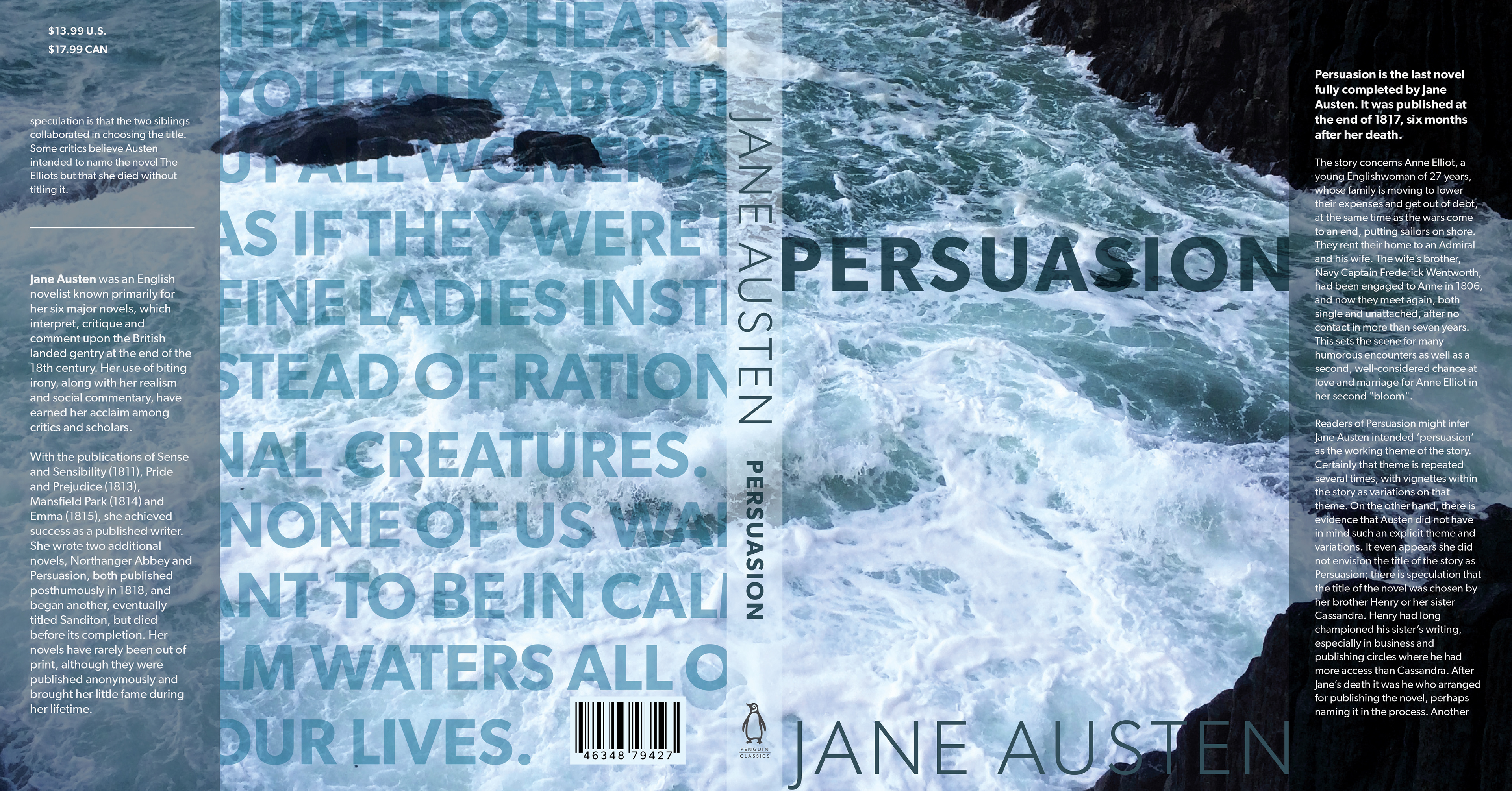
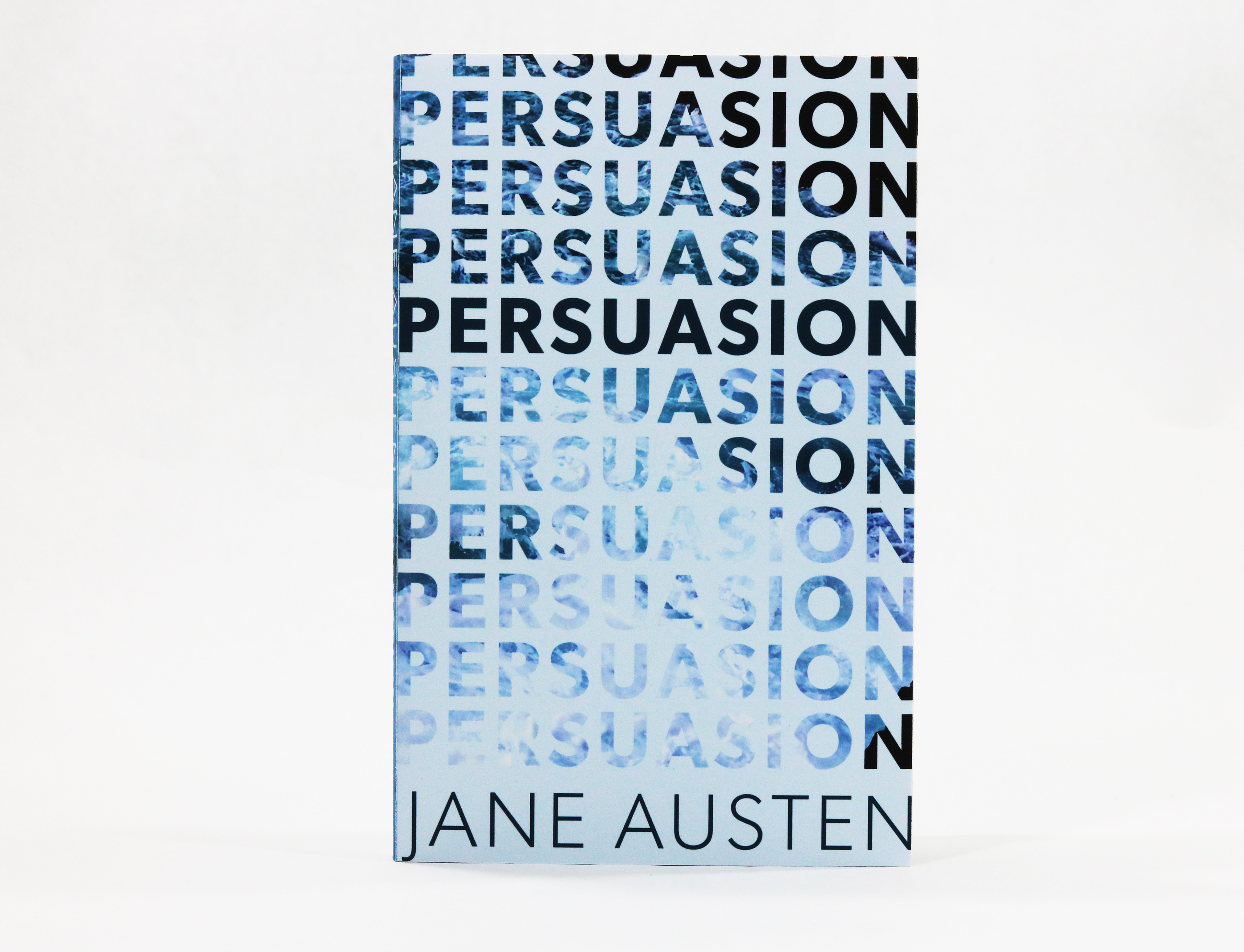
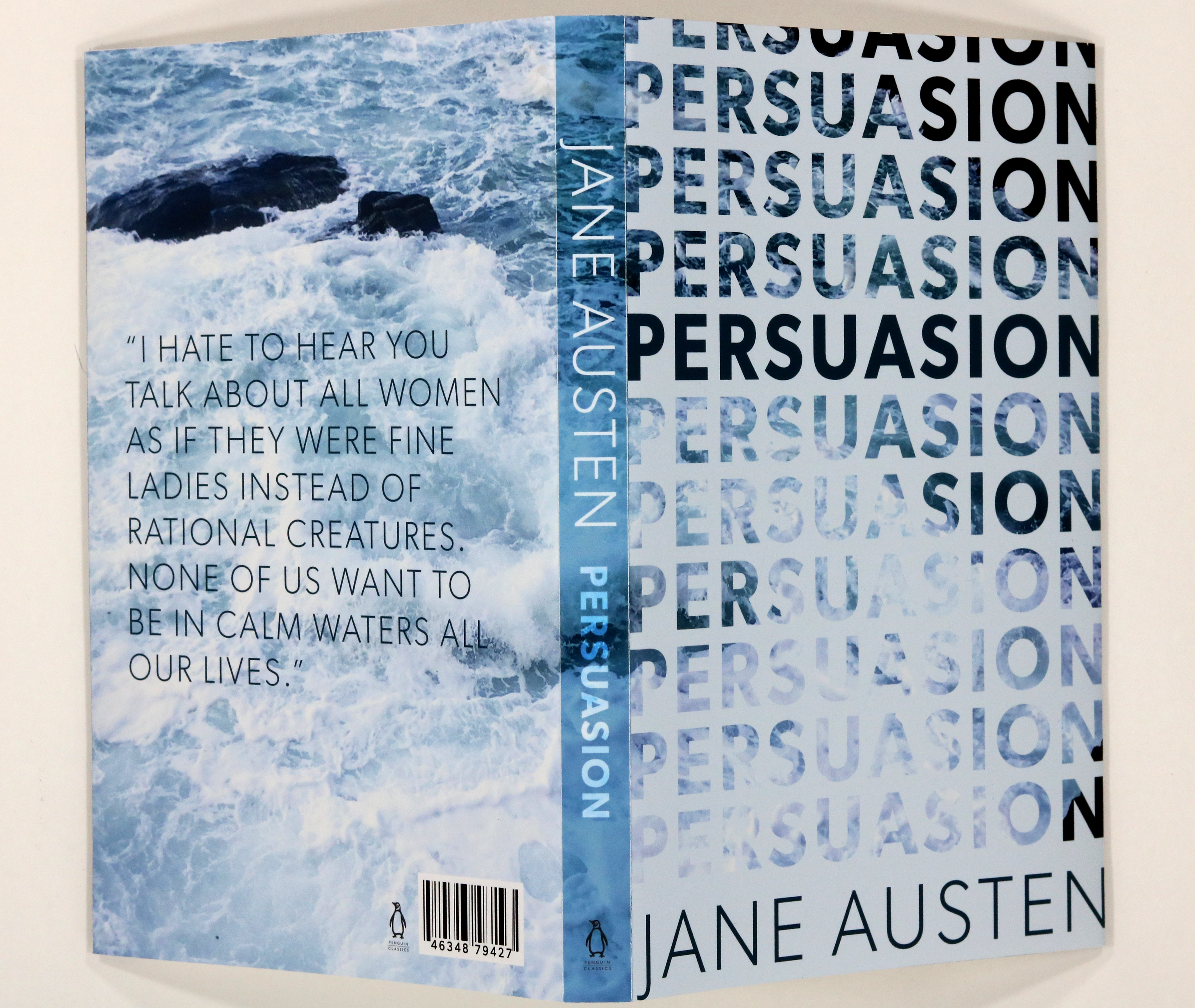
I found a photograph I liked from some of my own travels, and decided it suited my “anti-calm waters” theme. The first drafts omitted the title from the front, leaving it only to be ascertained from the spine. It was a bold move to leave the cover blank, sending a powerful visual message, but I eventually decided against it because it almost entirely undermined the title, which I do consider just as important as the themes. I also noted that the text-heavy design on the back was not strong enough to carry the overall design.
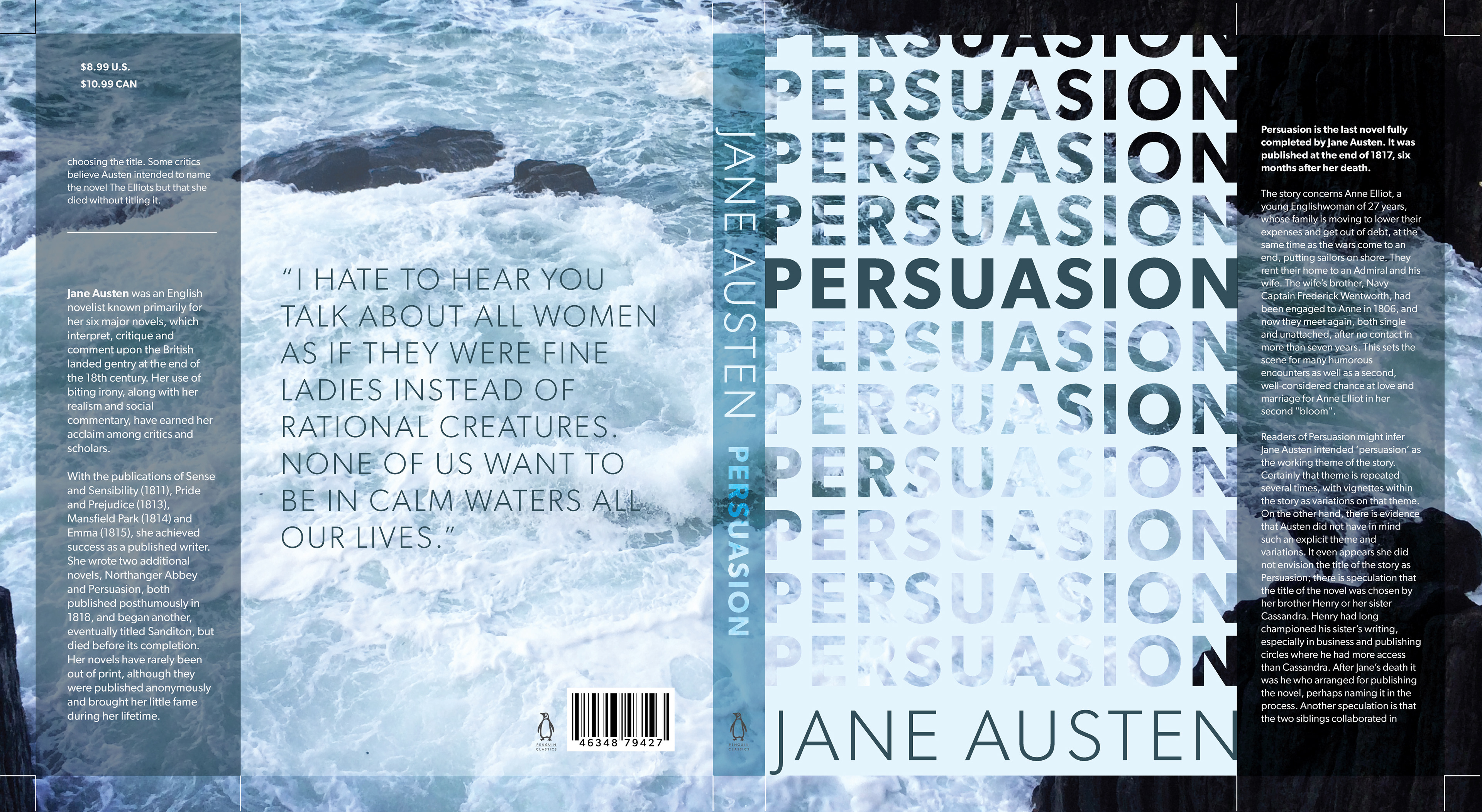
The final design did away with the heavy back text and instead opted for a more understated text weight. In contrast, I shifted the heavy text to the front cover. While I was reluctant to lose some of the strength of the image, I decided it was worth it for a number of reasons. Firstly, the visual message of churning waters being placed underneath is a direct reference to the attitude of the main character and the books central conflict. Secondly, as the text descends it disappears, which is a conceptual reference to the effect of persuasion on an individual.
For the project, we printed the cover and wrapped it around a book (comparable in size to the intended text) for display. I was especially satisfied to hear a classmate say that though she was not interested in Jane Austen, she would pick up this book.